Growing your List and Seducing Prospects to Register for Your Course
International Mentor Coach Program - USA / The NetherlandsHow We Help Our Cients / Business Cases
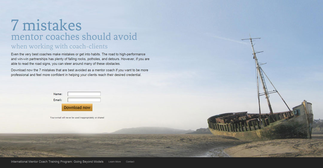
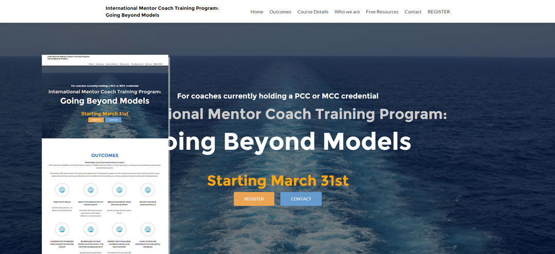
- From the creative concept to the look & feel and illustration, the design of the landing page, free resource and website make reference to the risks of stagnating and possibilities that open up after completing the course, hence the ship aground in the sand when prospects are at the beginning of their interaction to the open sea picture in the website.
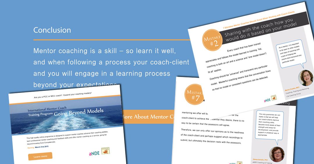
- The article to be used as free resource was redesigned to render it more appealing and readable and boost its value. The article was promoted through the experts’ networks and advertised using social media (Facebook and LinkedIn).
- To further establish the experts’ authority on the topic, their insights on each of the points in the article were included as comments, rendering the free resource even more valuable.
- After downloading the freebie, prospects would get several (automated) emails with information complementary to the freebie and inviting them to check the website to learn more about mentor coaching
- We created a one-pager site, with different blocks of information about the course benefits, the trainers, forms of payment and other relevant info to close the sale online.
- The homepage has been designed in such a way that it can be easily updated or adapted for new releases of the course.
Promotional Landing Page
For the delivery of the free resource we created a landing page where the objective was to highlight the content of the free resource (which made reference to mistakes mentor coaches should avoid) and invite prospects to download it. By using an image of a ship aground in the sand we underlined the risks of getting stagnated. Check how this works.
Valuable Free Resource
The free resource was a PDF with several tips on coaches’ potential blind spots (hence the shipwreck image). To add more value to the resource and further establish the experts’ authority on the topic we suggested to include the experts’ insights about the tips, presented as comments. In addition we proposed a different graphic approach to render it more inviting and legible so the value of the resource became immediately evident to the reader. Check how this works.
A one-page, responsive website for all devices, ready for registrations
We created a one-pager site, with different blocks of information about the course benefits, the trainers, forms of payment and other relevant info to close the sale online.


