Ajustar el sitio web y crear listas de contactos (en inglés)
Wealthy Wise Women - Holanda¿Cómo ayudamos a nuestros clientes? / Business Cases
- We started with redesigning a new header for the site in line with the target and the topic (and the likes of the client!).
- The overall styles followed. Font styles for text, headlines and subtitles were added to the style sheet to ensure consistency throughout the different pages.
- Once the basics were set, we reorganized the elements in the homepage, rendering it easier to read, and played with text and images in order to highlight relevant parts of the contents in a subtle manner.
- Other pages like contact and about, also had a makeover to enhance readability and render them inviting to read.
Free resource
- We advised on the free resource’s structure and did the editing & design.
- A matching landing page was created with autoresponder sign up form and email sequence.
- Create a Speak At Your Event page
- Have the sidebar showing up at specific pages throughout the site (as opposed to in every page)
- Newsletter sign up moved to the blog page
In 2016 I started my business with a website I wasn’t very happy about, as it did not resemble me and my work and it wasn’t helping me to grow my business. I asked b2M to help me turn my “I have an idea bla bla bla” into concrete workable plan of action and results and give my website a makeover. What b2M delivered was much more than just a website and content! Their dedication, eye for detail and perfection combined with their great (online) marketing expertise made them far than exceed my expectations. My website not only looks good but more importantly it supports my business strategy helping me grow my business and attracting more clients.B2M knows exactly what it means to overdeliver quality!
Sandra BoekhoudtOriginal Set Up
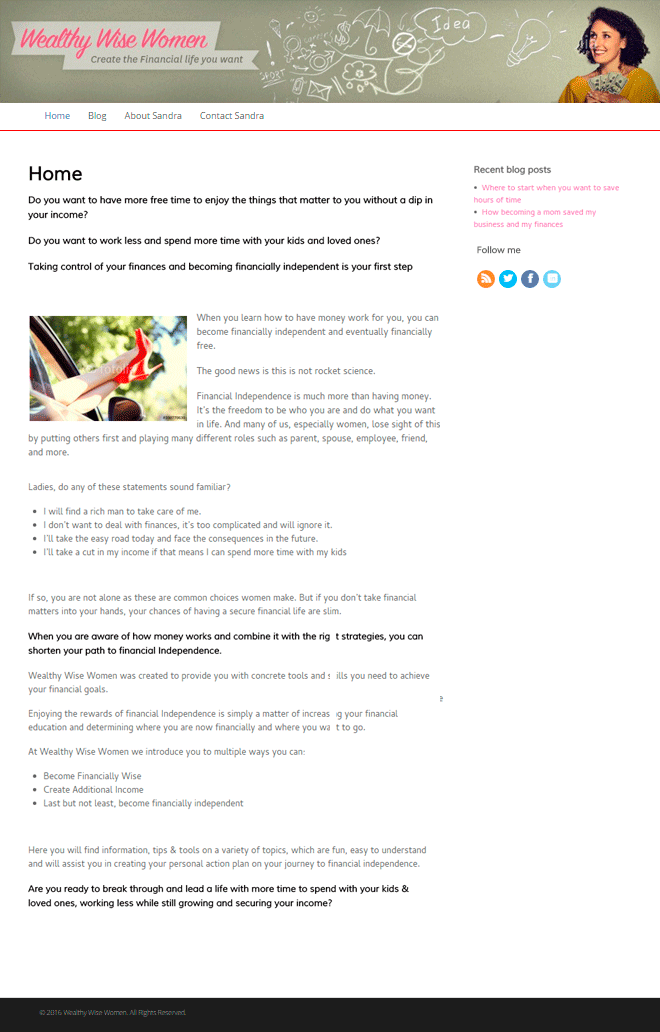
The original set up had a header with pastel colors, a too classic font lacking emotion and energy, and the image of the woman was not the right one to attract the intended target. This header gave the site an outdated look & feel and addressed a different target than the intended. The font styles were not consistent throughout the different pages, and the text was added to the page without leveraging on colors, bullets and images to render it more appealing.
The Makeover
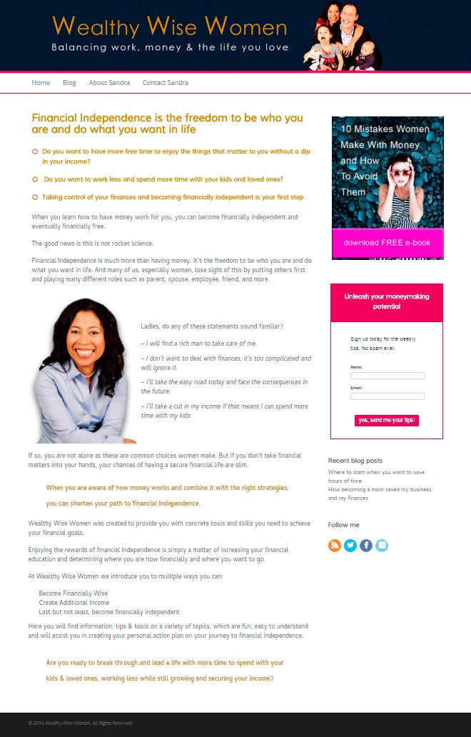
The new header with deep and brilliant colors has a more modern appeal. The image also addresses the main point right from the start: balancing family and work life. The content is highlighted with bullets and font variation within the style, attracting the attention to specific points on the page. The overall look & feel is fresher and more dynamic.
Promotional Landing Page
A powerful image in combination with the right (few) elements and a clear call to action render this is page eye-catching with high conversion potential. A beautiful sample of less is more! Check how this works.
Valuable Free Resource
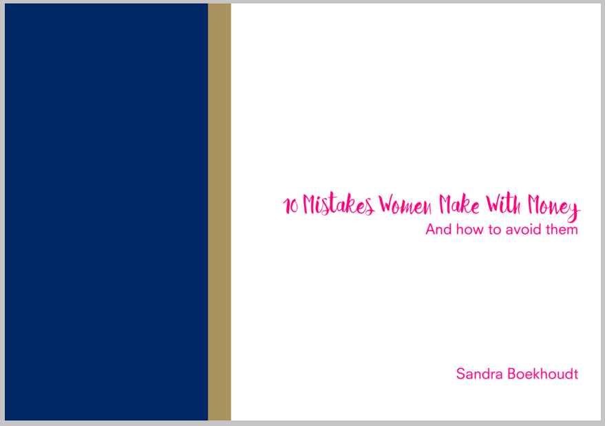
The free resource was one of the first things done in the new style. The colors -deep blue (elegance, business, sobriety), brilliant fuchsia (feminine), gold (richness) and white (balance)- are also strong elements of the design and complement the content in delivering the message. The design is elegant, powerful & feminine, which are important aspects of the target aimed at. Check how this works.
The First Step to Grow Your List
Landing pages are a visitor’s first impression of you and can make the difference between a successful marketing effort or a lousy one.The goal of a landing page is to make sure they sign up for your list before they go so you can continue the conversation and nurture the relationship.

The Free Resource
A good freebie has foremost one important element: value for your audience. Value starts with offering something that your ideal customer really wants. A free resource allows prospects to get to know you – while proving your expertise and making them eager to buy your services.
