New Website & Logo Refresh

Devergy - Tanzania/Amsterdam

How We Help Our Cients / Business Cases

Devergy is a social utility company using ground-breaking micro-grid technology to provide affordable and reliable access to electricity to anyone in the off-grid world in a sustainable and easily scaleable way. Thanks to their donors and investors, Devergy is expanding services throughout Tanzania with an eye on other countries soon. As a significant player in the sector of solar energy, it was time for Devergy to update their website, and have one that worked well for their different audiences: investors, partners, (potential) employees and customers. The client wanted a site that looked professional, portraying the company as the new utility for rural villages, bringing energy services and not only electricity. Thelook & feel should be sleek, modern and very appealing to its different targets. The site is to work flawlessly and look perfect on mobile devices,easily updated by their team, and with a structure  that would not look out-dated within the short term. In addition to the technical and design wise specifications, the site should not look similar to those of the competitors. An interesting challenge!
Devergy had a logo that quickly conveyed the essence of the company’s services: solar powered electricity. The logo had been in use since the company started operations back in 2012. With the new site aiming at showcasing the company’s ground-breaking technology, able to offer 24/7 service to its customers, and growing steadily, the client wanted a logo that communicated these features. Devergy’s founders and management were very happy with the logo and weren’t comfortable with the idea of  creating a new one from scratch, but were aware the logo needed an update. Thechallenge was to refresh their present logo, leveraging on its strong elements (color, twirl and name) without losing the original feeling of the logo.
Working with Bridge 2 More on the design of Devergy’s new website was a real pleasure. Claudia & Guillermo showed us passion and dedication from the first meeting through the final delivery. Every objective I had when briefing the job was met – the site is beautiful and functional, and it will be easy to maintain it as the company grows. Thanks for the hard work!
Tamara Mahoney

Media Relations, Devergy

devergy old homepage

New Website

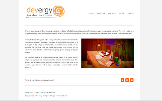
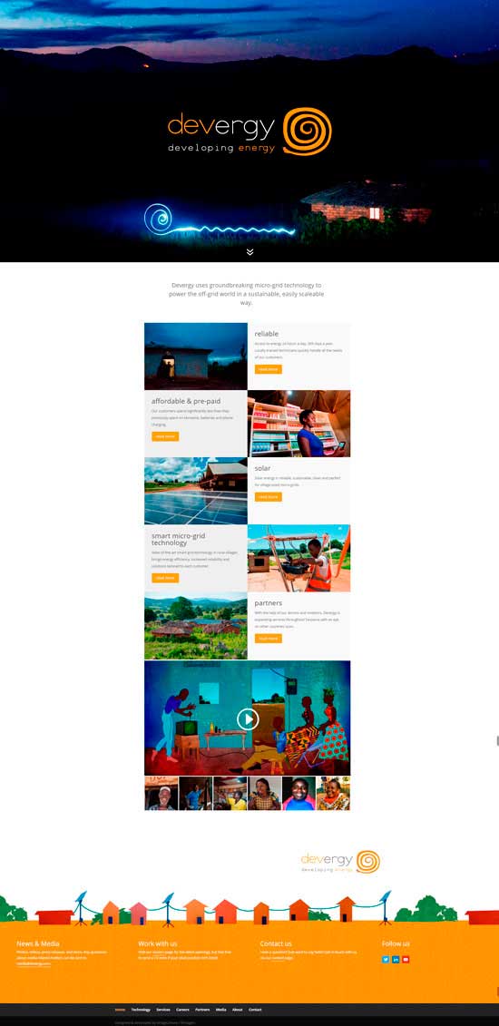
Devergy’s first site (image above) done when the company was in its starting blocks did not offer the possibilities needed to reach its different audiences. It was also text heavy and design wise too stiff. The new site (image to the right) is clean, elegant, functional, easy to keep up-to-date and fully responsive.The look & feel truly convey what the company stands for: ground-breaking technology, clean & sustainable energy, customer centered.

devergy new cover
click on images to zoom in
devergy old logo

Old logo

The client was happy with their logo, but aware it needed an update. Visually speaking the logo was heavy due to the use of thick lines, several color tone variations, serif font and the twirl being extended under the company’s name. When should you refresh you logo?

devergy logo makeover

Refreshed Logo

We incorporated a few updating changes to still retain the original feeling of the logo. The font was changed to  sans-serif, the number of color tones was reduced and the twirl extension under the name was shortened. This makes it possible for the company to use the twirl as a stand alone element, or only the name, and so being able to use their graphic corporate identification in square and rectangular spaces as well.

Refreshing Your Logo

Times change. Businesses evolve. Markets adjust.
With time certain color combinations, fonts and shapes in a logo can become obsolete and make it look old and stuffy; and that can make your company seem out of style or obsolete as well. Keep in mind you can make a few updating changes and still retain the original feeling of your logo. Even the most established businesses (Apple, McDonald’s, to name a few) update their logo as a reflection of their company’s ability to transform.
If you think that your business image needs revitalising, brige2MORE would like to help you. Let’s have a coffee and explore the options, no strings attached.
devergy's revamped logo

New website or a makeover?

As your business grows it can be the perfect time for a new website. The internet and it’s technologies have changed drastically in the last years, thus periodically reviewing the company’s website will definitely help in the long-run as more people continue to turn to the web first to gather information about different products and services. Design wise your site should cover all bases and accommodate for the various screen sizes that are available to consumers (responsive), be optimised for search (to be found faster), have captivating content (text & images), be easy to navigate, and last but not least, respond to a strategy to grow your business.
devergy homepage

Wondering if this could work for your own project?

Drop us a line so we can work together to apply this or other resources into your own business.